Written by Dan Martell

In the past ten years, the Internet has changed so drastically – so completely – that it’s hard to remember what a vastly different place it was in the 1990’s. The web was new and exciting back then, and everyone from businessmen to high-school tinkerers were compelled to put websites together and become a part of this growing trend. Not surprisingly, the designs they produced were brutally bad by today’s standards, yet despite graphical and technical changes in web design, there are still some businesses operating from remarkably outdated pages. These are sites that time forgot, and as the Internet speeds past them, they stand as a testament to a strange world not-so-long ago – the Internet of the 1990’s.
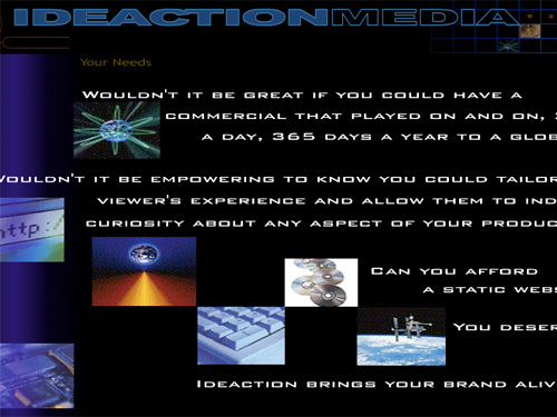
IdeaAction Media Productions
(source)
In 1999, this all-flash design would have been top notch, but today it just looks painfully dated. Though IdeaAction appears to have something to do with advertising, it is hard to tell exactly what because their descriptive paragraphs fly on and off screen too fast to read. Topping it all off, the entire video loops over mere seconds after their contact information is displayed, forcing anyone who might want to give them a call to watch the terrible production over and over again.
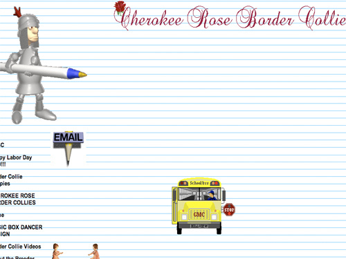
ABBC Breeders
(source)
Complete with Pink Floyd midi music playing in the background, the American Beauty Border Collies Breeders website is like taking a time machine back to the Internet of 1998. Simply viewing the tasteless layout and tacky animated GIF images that litter the page will make you remember a time when GeoCities and AngelFire were the primary website building utilities, and everyone who knew how to use copy and paste commands could create a homepage. The only essential 90’s web artifact missing from ABBC Breeders is some old fashioned flaming text.
Utah Ski Rentals

(source)
Animated backgrounds were a big part of the Internet in the 1990’s. Once designers realized they didn’t need to stick to the solid color page that worked so well for so long, it seemed that readability began taking a back-seat to animation and pizzaz. Soon, every website on the net started converting to annoying graphic backgrounds that made reading the actual text on the page a strenuous and tiresome activity. Utah Ski Rentals is unable to move on from this Internet dark age, still boasting a snowing background, randomly placed buttons, and scrolling text banners.
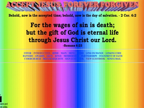
Dokimos
(source)
Speaking of horrendously annoying backgrounds, Dokimos takes the cake as the most unbearable. Featuring a scrolling rainbow of bright colors behind biblical scripture, the religious-themed website is impossible to look at for more than several seconds without being driven away, or even worse, going into an epileptic fit. Further dating the website to the 90’s is the presence of a guestbook, one of the oldest forms of commenting a web page. Not surprisingly, the first comment in the guestbook is from 1999.
Arngren
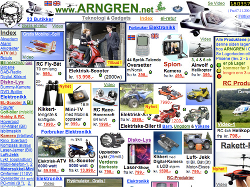
(source)
Arngren is a gadget sales site with an infuriatingly confusing layout. Looking like something that was thrown together in Microsoft Frontpage ‘98, the site scatters disconnected technology items for sale all across its main page with utter disregard to organization or ease of use. Look closely at the top of the page and you’ll see another component of every website to exist in 1990s, the long retired visual hit counter.
Cobra Strike Trading Solutions

(source)
CobraStrike is an awfully fierce name for such a timid website. Looking more like a pretty Microsoft Word document than a complete site, the trading firm says little about what it does, choosing instead to boast about profits and put a big, clip-art like picture of a cobra up for all to see. Signs of 90’s influence include the lifeless solid background color, the pasted in images that clash with the page, and the single page layout.
Party Tent City

(source)
Here’s a website that would have shamed even Expages designers in the 90’s. Massive text runs into small text, some of it is italicized, some of it is highlighted, and images and videos are randomly pasted in without formatting. The lack of any sort of navigation makes the whole site look like something a middle school web-hobbyist in 98 might have come up with.
DP Graph
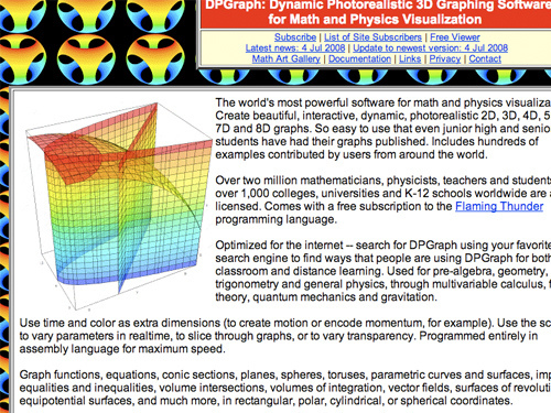
(source)
At least the designers at DP Graph were kind enough to place their text inside of a white box and not directly on top of their multi-colored spinning background so that we don’t have to squint and highlight to read it. Still – it’s 2010, can’t we leave the tiled animated background in the 90’s along with the words “phat” and “da bomb?” The bottom of the page says that it was created in 1997, and we can safely assume it hasn’t been touched since.
Smith and Goldsmith Inc
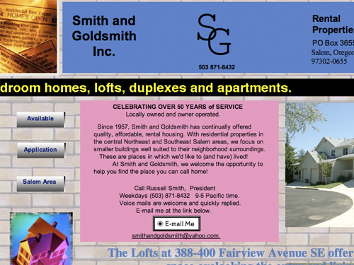
(source)
Still operating off the Homestead web design and hosting suite (another online design suite popular in the late 90’s), Smith and Goldsmith Inc round out our list with a design that features all the tells of a true 90’s page. First of all, the background is a tacky, tiled graphic – a common choice of amateur designers from the 90’s. Scrolling text banners interrupt the flow of the page to scream messages at you, text flows into images, images flow into images, and a visual hit counter proudly boasts the number of visitors. Last but not least, the site makes use of the ultra-popular side button navigation, a fad not seen on the web past the early 2000’s.
Thumbnail image source is here
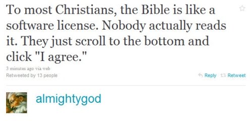
Bonus: Oh god, twitter.