Inspiration by Chris Spooner
Logos are everywhere. Because of this, only a few can rise among the noise — and often it’s the more unique logos that are most memorable. Sometimes to be unique, you’ve also got to be weird. In this post, we showcase twenty lovably strange logos that work.
Society 27

The Society 27 logo by Pavel Pavlov makes use of the fantastic ambigram effect, which ensures the logo display exactly the same when viewed in an upside down position. The abstract use of the quotation marks and number seven cleverly make up the complete 27.
London Symphony Orchestra

The LSO logo uses a single flowing line to create the three initials of the London Symphony Orchestra. The semi-representational shapes are recognisable enough to be seen as letters, but also allows the logo on a whole to be seen as an elegant graphic.
I love NY

The simple yet highly recognisable mark of the I Love New York has been used to promote tourism in New York for years. Known as a Rebus logo, it displays a large red heart graphic to symbolise the word love, while representing the word New York with the two initials N and Y.
Museum of London

The new Museum of London logo first appears to be a collation of current logo design trends, but with deeper inspection and research the underlying meaning of the logo is discovered. The organic shapes that make up the logo represent the history of London, showing its growth over time expanding geographically.
Metroplex

The Metroplex logo by BrandBerry creates an excellent sense of depth with the use of three dimensional shapes. The array of cuboid shapes represent skyscraper buildings which make up the overall metropolis graphic, linking well to the meaning behind the name.
Cattleyard

Another logo that links well to its name and subject is that of Cattleyard Promotions. Being a music related business the logo uses various graphics of instruments but combines them to form the overall shape of a cow, bringing together these two inspirations into a unique mark.
CafeClick
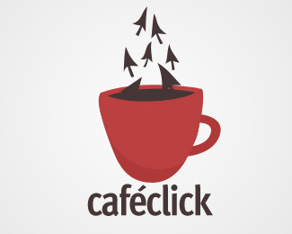
The CafeClick logo uses an accepted icon of the internet, the mouse cursor and brings it together with a mug of coffee by replacing the steam. This cleverly links these two elements making a brilliant logo for an internet café.
Logo Motives

The Logo Motives brand that represents designer Jeff Fisher is an admirable collation of imagery and letterforms. The manipulation of the letters O and G allow them to fit seamlessly into the overall train graphic with perfect geometrics all round.
Rehabilitation Hospital Corporation of America

The highly symbolic logo of the Rehabilitation Hospital Corporation of America logo communicates a complex message with just a simple design. Using the globally renown cross symbol to represent help and medical attention and the steps to reflect on the steps taken back to normal life.
Schizophrenic

Another logo that plays in representational symbols while relating heavily to the brand name is the Schizonphrenic logo. Being a medical disorder that often depicts split personalities the logo characterises this with simple shapes that depict a happy and sad face.
Curious

The word curious often goes hand in hand with questions, this is smartly represented in the Curious logo by Action Designer. Using the question mark symbol depicts this while being manipulated to fit into the logo by replacing the letter C.
Modern Nerd

The Modern Nerd logo makes fine use of negative space to fool the eye into seeing the overall image of a figure, using just the symbolic shapes of hair, glasses and tie it links in well to the stereotypical geek/nerd image.
Time Watch

The Time Watch logo brings in elements from daily life to enhance the meaning of the logo. The colon is commonly used on digital clocks and watches, in the logo it is cunningly used to replace the letter I giving a great looking and representative mark.
Full Time
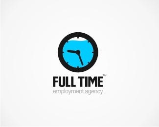
Taking on a more lateral depiction of the brand is the Full Time logo, this mark takes a clock as the symbol of time and uses it as a container of water to represent time being full.
Upside Down

The clever execution of the Upside Down logo maintains legibility by manipulating select letters to represent the brand name. By using alternate letters or flipping the orientation of a letter gives an unusual appearance despite being easily reabable.
Candy

The combination of two images into one is what makes the Candy logo so great. Using both a stereotypical sweet product and an illustration of a girl’s head link in well to the nature of the product. Even the wording blends in to become part of the artwork.
Seven and Six
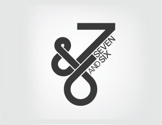
The geometric layout of the Seven and Six logo creates a groovy looking mark that also acts as the graphical alternative of the brand name. Using the numeric figures and the ampersand reinforce the complete worded variations.
Studio Eight

The flowing lines of the Studio 8 logo create an illusion that allows both the initial S and number 8 to be visible in the logo graphic. Splitting the lines at the appropriate places stops the eye from following the curves in order for each symbol to appear.
Zip

The three letters of the Zip logo are blended together to form an almost solid shape. The centre graphic which represents the real life object also holds together the logo by breaking up the block allowing the letter I to be seen as well as allowing the Z and P to become legible.
Bison

The Bison logo by Seamus Leonard is an excellent example of how letters of a word can be distorted to create a completely different shape to reinforce its meaning while maintaining readability.
Thanks for great article – I think these logo’s are brilliant.
I think the LSO is meant to be a conductor – the L is his baton, and the S and O form his head and left arm. 🙂
Truly gr8 work..the logos are brilliant..such creativity!!
Brilliant … simply loved it
I remember when the “I (heart) NY” ad campaign came out over 30 years ago, complete with a theme song that is still stuck in my head. I see it today in shirts even in Minnesota. I wonder, however, if most people mistake it for a nod toward New York City, when, in reality, it was trying to appeal to the state as a whole. By the way, there is SO much more to the state than NYC, but it only gets publicity when Buffalo gets clobbered by snow.
what’s weird about them logos?
it’s not why they do but how they do that is explained here. It’s interesting to read but I am disappointed cause I expected something else by the title of this post …
These are genius!
I’ve been trying to come up with something as amazing as these for some time. I’ve decided to stick to what I know, nothing.
Thanks for bringing these out..
I agree. I know this post is really old, but looking at the LSO logo again, I see that very same thing. When I first saw it, I thought of it being the line drawn in the air by the conductor's baton, but that didn't quite fit. So you have a stylish logo, the acronym, and then also the image of the conductor. And so simplistic/minimalist. I love it!
i love them all especially the i heart ny one!
my favourite has got to be the curious one.